Thursday, March 26, 2020

Represent NHS Blood campaign

1) What does BAME stand for?
BAME stands black, Asian, minority and ethnicity.

2) Why is there a need for blood in the BAME community? 
Only 3% person of the BAME community donate however we need more donors from the BAME community.

3) What does this advert want people to do once they've seen it (the 'call to action')?
The advert motivates others to donate blood and save other people's lives.

4) Why is the advert called 'Represent's

This is because it shows many people representing the BAME community.

5) Why have the producers chosen famous BAME celebrities to feature in the advert? Give an example of three well-known people who appear in the advert and why they are famous.

The first black person we see is the lead Rapper(lady lashurr) of the advert NHS Blood campaign. The second black person we see is Nicola Adams as she is the Gold medal boxer. And Lastly, we can see the CEO of MOBO is Kanya King.


6) Why is there a slow-paced long shot of empty chairs at the end of the advert?

To show that they need more BAME background blood donors in the UK is very important to the NHS 


7) How does the advert match the key conventions of a typical urban music video?
the narrative which is rapping, storytelling  and the camera is slow and fast 

8) How does the advert subvert stereotypes? Give three examples (e.g. ethnicity, masculinity, femininity, age, class, disability/ability, etc.)

It shows a disabled basketball player(Ade Apatian) in a wheelchair next to the Olympic Stadium. This has been deliberately used to show that anyone can be an Olympian and anyone could do anything. also the boxer Nicola Adams  

9) How does the advert reinforce certain stereotypes of the BAME community? Could there be an oppositional reading where some audiences would find this advert offensive or reinforcing negative stereotypes?

Some people could find this rude or offensive because if only 3% are donating their blood, what's the point of donating it because it's not going to make a difference.so that why lots of people might not donate
10) Choose one key scene from the advert and write an analysis of the connotations of camera shots and mise-en-scene (CLAMPS).
the props at the end of the 3 chairs might suggest how many people are dieing as the blood bag is empty

Monday, March 23, 2020

OMO advert

1) What year was the advert produced?
 The advert was produced in 1955

2) How were women represented in most adverts in the 1950s?

in the 1955s women represented as objects as they are always in the kitchen and they are mothers or housewife 


3) How does the heading message ('OMO makes whites bright') and typography promote the product?


it tells the buyers that it will make your clothes that are white even whiter.  

4) Analyze the mise-en-scene in the advert (CLAMPS): how is costume, make-up and placement of the model used to suggest women's role in society?

the m in clamps is  
The makeup which is done perfectly for the women which might indicates that even if she cleans she will still look pretty.


5) Why is a picture of the product added to the bottom right of the advert?

the picture is added so when the buyers are looking for this product they know what to look for. 


6) What are the connotations of the chosen colours in this advert?

In the advert, there are white red and blue colours used. these might be because these are the colors on the box so this might be their color schemes


7) How does the anchorage text use persuasive language to encourage the audience to buy the product? Give examples.

OMO makes white bright!is used a lot to show the consumer that what they are saying is true as they are saying it so many times so when they are in the shop that slogan is going to be in  their  head so they might buy it 


8) What representation of women can be found in this OMO advert? Make specific reference to the advert and discuss stereotypes. that women only can clean/cook and there supposed to look pretty everywhere they go.and be happy doing it 


9) What is the preferred reading for this advert - what did the producers of the advert want the audience to think in 1955?
The preferred reading is  the people in the 1950s would buy this product and not have any thoughts on sexism since they were all used to it in the 1950s.


10) What is the oppositional reading for this advert - how might a modern audience respond to this text and the representation of women here?


the modern audience would think that the advert is horrendous since it's very sexist and stereotypical and they would want the company to delete the OMO advert. also, they will be destroyed on social media 

Thursday, March 12, 2020

Gender representation in advertising


1) Find three adverts featuring women that are from the 1950s or 1960s. Save the images to your Media folder as jpegs and then import them into your blog post. Hint: You may wish to look at car, perfume or cleaning products but can use any product you wish.


3) What stereotypes of women can you find in the 1950s and 1960s adverts? Give specific examples. 
The stereotype I can see in the 1950s adverts is that the women are doing things like making food and cleaning up. We can also see that all of these women have a lot of makeup on and that a very happy doing there jobs 


2) Find three adverts featuring women that are from post-2000. Save the images to your Media folder as jpegs and then import them into your blog post.

1This ad beats all. American Apparel ad shows a unisex shirt worn by a man and a woman. See the difference?


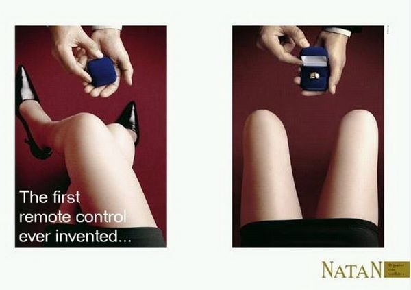
2. A jewelry ad that shows how women can be bought by jewelry.


4) What stereotypes of women can you find in the post-2000s adverts? Give specific examples.


in the 2000s the advert women are being sexually objectified  but in   more secret way  advert only being used for their bodies and as an object to men. like in advert 2 the girl opened her legs for the ring 


5) How do your findings suggest representations of gender have changed over the last 50 years? 

the representation of women has changed but women are still  being  objectified in a way that the media make fun of it 


Thursday, March 5, 2020

Advertising key conventions

Image result for print advert


1) What key conventions of an advert can you find and what are the connotations of each one?

  • Picture of product
  • USP - unique selling point. 
  • Setting/colour scheme 
  • Slogan – this is a catchy phrase summing up the ethos of the product e.g power full
2) For each convention, write about how this appeals to a target audience. 
 slogan "power-full," tell the consumer if they drink there coffee they will have the energy for the whole day
picture of product- the coffee tells us about what it is about

3) What is the USP (unique selling point) of the product and how do you know?
  the USP of this product is a cup of coffee that will give you fill you up with its fuel
which Caffeine and  sugar 

Wednesday, March 4, 2020

Magazines assessment learner response


1) Type up your feedback in full (you don't need to write the mark and grade if you want to keep this confidential).
WWW: 
There is a clear potential in your answer..you understand the terminology and can analyze media text.
Now you need to add the depth to reach the higher levels in the making scheme 
EBI: written English and handwriting is holding you back 


2) Read the mark scheme for this assessment carefully. Write down the mark you achieved for each question:

Q1:1/2
Q2:6/12
Q3:3/8

3) Did you get any media terminology wrong in the assessment? Make a note of it here for future revision:

No, I did not get any terminology wrong. 


4) Look specifically at question 2 - pick out three points from the mark scheme that you didn't include in your analysis of the unseen Grazia magazine cover.
Colour palette
Royal green to further reinforce connotations that Kate Middleton is married into the Royal
family and emerald green is associated with the monarchy.
Design and layout
All around the main image in a neatly packed style, other features that will appeal are listed.
This communicates to the audience that the magazine has a lot to offer them.
Verbal codes (use of language)
The personal relationship with its reader – ‘When did we stop being honest with friends?’
 Direct mode of address to the audience – ‘To shake up your wardrobe’

5) Now, look at question 3. Use the mark scheme to identify three points you could have made regarding how Tatler reflects British social and cultural values.
The Tatler front cover:
The preoccupation with parties, University, luxury holidays and exclusivity (the ‘Tatler
Privilege Club’) assumes a high level of income and an elitist attitude which may alienate or
offend people from a different social class.
 The cover line referencing ‘Millennial Sloanes’ reinforces the young upper-middle and
middle-class target audience that this magazine could potentially appeal to.
Image is important
The issue is more interested in fashion, merchandise, beauty and ‘lifestyle’ rather than
dealing with news in any depth
 The use of strong make-up suggests luxury and socializing, which has synergy with the cover
lines about socializing and ‘aristo’ which means aristocratic (ruling class).

Monday, February 10, 2020

Reveal: case study blog task


Media language
1) How many of the 12 magazine cover key conventions feature on this edition of Reveal? List them with specific reference to the convention on the CSP edition of Reveal.
Colour scheme-vibrant colours 
Name Checks- "Cheryl,Lauren,mark and Michelle,Katie and Pete"
Title of publication-REVEAL
Central image and secondary image
2) What is the font choice used on the cover and what does this choice connote? 
The font is San serif and it represents that they are more modern  3) How do the cover lines appeal to the Reveal target audience?
to cover line apples to the audience as it tell us about secret meeting between 2 celebrity 
4) What are the connotations of the Reveal colour scheme on this particular front cover?
the connotation  of the of the magazine are more for women and the use of bold writing "99P" in yellow is trying to intrigue the reader to buy this as it is very  cheap   5) How are images used to create interest in the magazine? Find three reasons for your answer. (E.g. mise-en-scene such as props, costume and make-up, body position, facial expression).


The central image is not posed because it was taken by paparazzi and the coverlines makes you want to read on because it seems as something secretive is happening which might intrigue the reader 

6) What differences can you find between the use of design and typography between Tatler and Reveal? List at least three and explain the effect on audiences.


The difference is in Tatler there is only  one central and that was in a photo shot but in reveal we can see multiple images and most of them are taken by paparazzi.Anther difference is Tatler is an older magazine and there title is in Serif but in reveal in is more on the san serfi side which can show us that it is very modern and it is moving with the time   

Representations


1) What type of celebrities appear on the front cover? How are they represented in Reveal? (Positive? Negative? Reinforcing or challenging stereotypes?)


The type of celebrity are pop and reality celebs . Reveal makes the celeb look in a Negation way to show the audience it is normal to ^stuff the diet^  

2) How are women represented on the cover of Reveal? Think about both images and cover lines here.

Women are present in a more powerful way that to the men 3) How do Reveal and Tatler represent social class? (E.g. middle/upper class and working class)
Tatler is amiss at upper middle class but reveal is amid at working class

4) What would be the preferred and oppositional readings to this cover of Reveal?


The preferred reading for this cover of reveal would be the reader will gain knowledge on many new things about all issues included in the article and they will get many insights into the lives of higher classed individuals.  

Social and cultural context


1) What aspects of British life are reflected in Reveal? How does this compare to Tatler?

The working British life is shown in reveal and the upper class of the British life is shown in Tatler 

2) What do the cover lines in Reveal suggest about the issues and lifestyle of Reveal readers?

The cover line intrigues the eyes and attracts them in to what is happening next 
.
3) Find three other front covers for Reveal. What issues or features regularly appear in Reveal? 
Stuff the diet
Lauren’s true love 
Katie plots secret meeting with Pete

Thursday, February 6, 2020

Magazines: Tatler CSP case study


             Introduction - Tatler Media pack
1) Look at the Tatler Media Pack. Go to page 2: how does the editor introduce the magazine?

The editor introduces the magazine is made for rich when 
KATE REARDON said "‘‘TATLER IS A FABULOUSLY TARGETED, SENSATIONALLY ACCURATE RIFLE SHOT TO THE VERY RICHEST READERS IN THE COUNTRY." this might connote if you are poor you should go find something else. But if you are rich this magazine is for you   


2) Now go to page 4 of the Media Pack. Focus on the print magazine (NOT tatler.com - the website). List the key demographic details: age, gender %, ABC1 % (social class), HHI (Household Income), % of those living in London and the South East. What do these demographic details suggest about the average Tatler reader?


These demographic details suggest that an average Tatler reader is of the ages of 41, are mostly female, are most likely in the upper class or upper-middle-class and have Average HHI of  £261,572. this can tell you that a Tatler reader most is a very affluent female that lives in London and the southeast.


3) Look at page 6. What do Tatler readers think about fashion? How much do they spend?

I think they spend a lot of money on fashion because there appearance id the most important thing to them so the magazine is basically telling them what to buy if they want to look nice and stay in  fashion 


4) Go to page 10. What are the special editions of Tatler that run throughout the year? What does this suggest about the psychographic groups who read Tatler?


they tell you that if they are going on holiday, having a wedding, Beauty & Cosmetic Surgery Guide, Spa Guide, Watches & Jewellery Guide, Schools Guide. they will just go in the magazines and look at what they like  original and they have the money  to buy this thing with any savings because Tatler is mostly aimed at the class


                                 Media language


Revise the 12 magazine cover key conventions and check how many feature on this edition of Tatler.

1) What different examples of typography can you find on the cover of Tatler? What are the connotations of the serif and sans serif fonts? 


"Serif
Serif fonts have tabs (or 'feet') at the corners of the letters. Serif fonts are more old fashioned, traditional or authoritative. They are particularly suited to long passages of text as they create a 'line' for the reader to follow.

Sans Serif

Sans Serif fonts are more modern and do not have tabs or 'feet' on the letters. They are used for titles, headings and create a more contemporary, modern feel to the product."
2) How do the cover lines appeal to the Tatler target audience?
 it grabs the eye of the  target audience because it is what most tatler readers want to read.   when he talks about the one month gap year because rich people like to go on holiday  


3) What are the connotations of the Tatler colour scheme on this particular front cover?

 it has natural vibes and colour  and the pink can connote to   feminine 

4) How is the central image designed to create interest in the magazine? Find three reasons for your answer. (E.g. Mise-en-scene such as props, costume and make-up, body position, facial expression)


the image is designed to create interest to a  tatler reader interested in the women on the cover. one reason is her clothes, makeup and the sell line saying "meet Georgina Bevan" which will    the consumer to her and her new pearls.


                      Representations

1) What different groups of people are represented on the cover? (E.g. men/women/white people etc. Look at the image and text/cover lines to help here)


the representation of a  rich white woman in the upper class  front cover and we can see aristocrats
2) What do the cover lines suggest about the lifestyle of rich people in the UK?
the cover suggest famous and rich people like James cordon and talking about one month gap years

3) Are there any stereotypes being reinforced or subverted? How? Why?

rich white people in the front cover we can see a white women 

4) What would be the preferred and oppositional readings to this cover of Tatler? 


the preferred reading is a  rich white woman in this  magazine .the oppositional reading is only white people can be on this magazine 


Social and cultural context

1) What aspects of British life or people are NOT reflected in Tatler? (Watch the clip above again if you need help with this - the clue is in the title 'Posh People')

the parts that are not shown in the poorer parts of the British  life 
2) Tatler runs special issues on holidays, spa breaks, cosmetic surgery, watches and jewellery and private schools. What does this suggest about the magazine's representation of life in Britain?

this tell us that tatler reader have the money to pay for privet school and thousand of pounds to pay for a one day spa    

3) What audience groups might be offended or insulted by the front cover of Tatler April 2017?

non white people might get offended because in most of the tatler front covers we can only see white people   

4) Find three other front covers for Tatler. What issues, subjects or people are regularly featured in Tatler?
Travel Guide,Weddings Guide,Beauty & Cosmetic Surgery,Guide,Spa Guide,Watches & Jewellery Guide


Statement of Intent: task

Your name Samir Ewas Statement of Intent Introduction Horror film title : 7 minutes of hell .    Tagline : the clock that always stops. or t...